This is how Omring gains better control over its carbon footprint

Project facts
- Client
- Healthcare organisation Omring
- Location
- Noord-Holland, Netherlands
- Date
- 2025
- Challenge
- How do you gain control of your carbon footprint within a complex healthcare organisation with 30+ locations for residential care, home care and home care shops?
- Solution
- A Carbon Flow Chart based on scope 1, 2 and 3, integrated into our Net Zero Tool, including visual dashboards and concrete policy recommendations
Turning sustainability ambitions into reality
Omring is a healthcare organisation in West Friesland (northern part of North Holland, Netherlands) with a clear ambition: to become the most sustainable healthcare organisation in the Netherlands by 2030. Health is at the heart of everything they do, today and for the future. From residents and patients to employees and society as a whole.Due to new legislation, such as the CSRD (Corporate Sustainability Reporting Directive), organisations are required to provide insight into their climate strategy and report on it.
Where do you start when your organisation consists of more than 30 locations for residential care, home care and home care shops, with a continuous flow of goods, commuting and waste?
Insight through a CO₂ flow chart
Together with Omring, we started a working session to define the scope of the footprint analysis. We analysed the processes that take place within the organisation: Which locations are owned by Omring and which locations are being rented for which type of care (residential care, home care or home care shops)? What falls within the operational and organisational boundaries? Which activities contribute to CO₂ emissions? By answering these questions, we created a solid foundation for the analysis.Next, we collected and validated data for scope 1 (direct emissions), scope 2 (indirect emissions via energy) and scope 3 (indirect emissions in the chain). Omring had already identified its scope 1 and 2 emissions and transport and wanted to verify these with us to ensure that the calculations were correct. Because Omring has been actively engaged in sustainability for some time, a lot of additional data was also available. This went beyond just energy consumption. We also analysed water consumption, mobility, waste streams, real estate data and purchasing data. This provided a complete picture of the organisation's carbon footprint.
Emissions were calculated per ledger account, using exports from Omring's ERP system. We used emission factors that included delivery and checked our calculations against external studies from the healthcare sector.
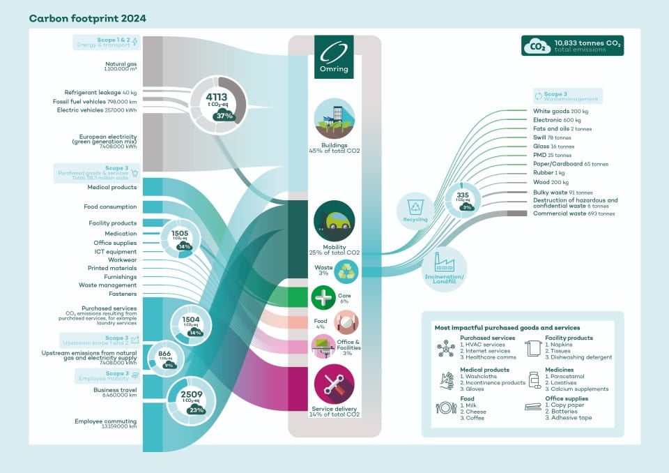
All data is integrated into our Net Zero Tool, within which we have built interactive dashboards. These provide direct insight into reduction opportunities and make it easy to monitor progress. The visual representation, the CO₂ flow chart, shows at a glance where the largest emissions are and where the greatest impact can be achieved.
The results: from insight to policy
The analysis identified three categories with the most significant impact:
- Procurement of goods and services: 28% of the total footprint (14% goods, 14% services)
- Mobility: 23% of the total footprint (15.5% commuting, 7.6% business travel)
- Natural gas consumption: 17% of the total footprint
Scope 3 was responsible for 63% of total emissions. And that share is growing: the switch to green electricity in 2025 will reduce emissions from scope 1 and 2 by 20%, meaning that scope 3 will soon account for 77% of the total footprint.
Based on these insights, we advised Omring to focus on reducing emissions in these three categories. For example, by strategic collaboration with suppliers to improve the data quality of purchased goods. And a mobility roadmap with concrete measures such as:
- Encouraging cycling and public transport
- Transitioning to electric vehicles
- Facilitating remote working where possible
- Introducing electric shared transport for home care
The mobility roadmap is currently under development and is in line with Omring's existing plans. The CO₂ flow chart also emphasised the importance of mobility within the overall footprint. In addition, the analysis per residential care location now provides insight into where the greatest impact lies. For example, one location has already started reducing the use of incontinence materials. In fact, it has been determined that two residents do not yet need to use these materials. Thanks to these insights, locations can now get to work with practical tools for change.
Would your organisation also like to be more in control of its carbon footprint? Our experts are happy to help you with a customised analysis, a visual carbon flow map, and a dashboard that will help you further. Contact us and discover how you can make sustainable choices with data and insight.
Contactour experts
Would you like to read more?


 Future proof & sustainable buildings
Successfully improving the sustainability of buildings
 Sustainable buildings